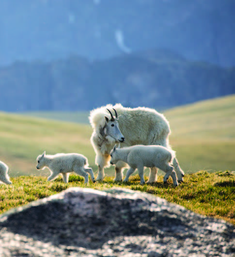
 Park County, MT
Pillar 1
Captivating Landscapes
From the quiet springs to the golden autumns, the wonders never stop arriving.
Read the story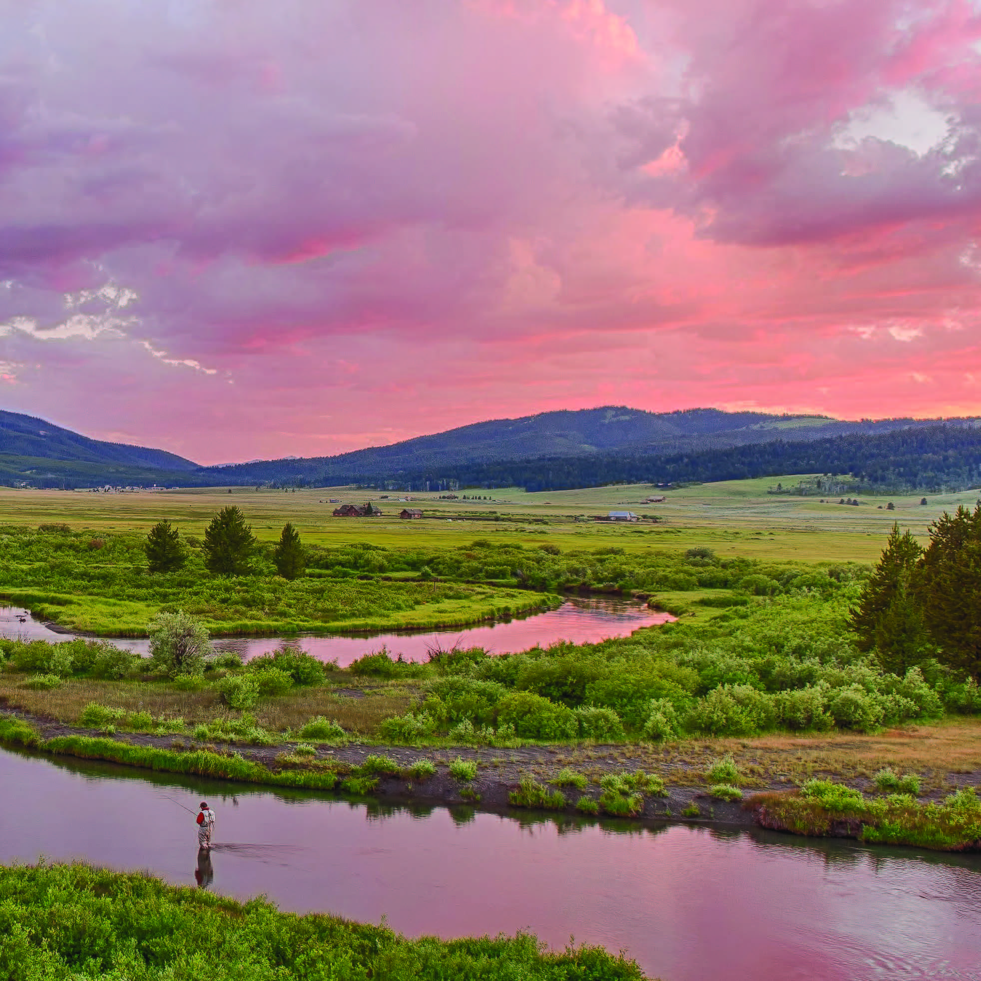
A complete UI kit — tokens, type, components, and patterns — packaged as a Less framework. Drop it into any Windfall project, override the variables, and ship something that already feels like Montana.
The kit ships as Less. Pull in the framework, override the YC option file, and import the components you need. Or just link the compiled yellowstone.css and skip Less entirely.
Recommended for production. Gives you tree-shaking, mixin access, and the ability to override any variable.
// app.less
@import "orca/options";          // Orca defaults
@import "orca/yellowstone";      // YC overrides — colors, type, radii
@import "orca/colors";
@import "orca/modifiers";
@import "orca/plugins/buttons";
@import "orca/plugins/cards";
@import "orca/plugins/forms";
@import "orca/plugins/alerts";
@import "orca/plugins/navigation";
For prototypes, marketing pages, or anywhere you don't have a Less pipeline.
<link rel="stylesheet"
  href="https://cdn.windfall.com/yellowstone/yellowstone.css">

<!-- Brand fonts (Adobe). Falls back to Lora / Barlow / Inter. -->
<link rel="stylesheet"
  href="https://use.typekit.net/yourkit.css">
Hex values and steps match less/colors.less and utility classes in less/shades.less (.-{name}-{step} / .-{name}-{step}-bg). Families: gray, orange, red, yellow (legacy .-gold-* aliases yellow), navy, blue, tan, green, moss, brown, teal. .-primary-* mirrors navy. Page background uses @tan-100 (= @cream). Pure white is for cards and inputs; brand “black” is @granite.
Each chromatic row uses its 500 step as @{name} (e.g. @yellow → @yellow-500). :root exposes --gray … --teal plus --granite, --cream, --tan-100. Granite has no numbered scale.
Neutrals — borders, dividers, muted text.
.-primary-000 … .-primary-900 (and -bg) mirror these steps.
Cool slate blue — distinct from navy.
Warm field tones; @tan-100 / @cream for large surfaces.
// less/colors.less — @gray-000 … @teal-900, @granite, @cream
// less/shades.less — .-gray-500, .-navy-700-bg, .-yellow-300, …

@import "colors";
@import "shades";

@primary: @navy;
@accent:  @yellow;
@light:   @tan-100;
@black:   @granite;
Editorial serif (Bookmania) for display, Trade Gothic for body, DIN Condensed for ALL CAPS eyebrows and small UI labels. Italic Bookmania is the brand's signature interior emphasis.
We help visitors plan their trip to one of the most special places in the country — and remind ourselves how lucky we are to live here.
Simply being perched on the edge of Yellowstone National Park would be enough to make that claim — but there's more. A lot more. From the quiet springs to the golden autumns, the quintessential summer adventures to the world-class winter recreation, there is always something to do.
// orca/yellowstone.less — type stack
@font-serif: 'Bookmania', 'Lora', Georgia, serif;
@font-sans:  'trade-gothic-next', 'Inter', system-ui, sans-serif;
@font-cond:  'urw-din-condensed', 'Barlow Condensed', sans-serif;

// Modular scale, ratio 1.25
@text-xs: 12px; @text-sm: 14px; @text-md: 16px;
@text-lg: 20px; @text-xl: 24px; @text-2xl: 32px;
@text-3xl: 48px; @text-4xl: 64px; @text-5xl: 88px;
The recurring 90px gutter where tan meets photography is a brand signature — preserve it. Inside content blocks, use the standard 4-based scale.
Base-4 with brand-specific 90 / 120 for layout-level gutters.
| Token | Use | Value |
|---|---|---|
page-gutter | Side margin on full-bleed pages | 90 / 120px |
header-h | Fixed header / footer band | 90px |
content-max | Editorial column max-width | 1280px |
section-y | Vertical rhythm between sections | 100px |
card-pad | Inside card padding | 24px |
field-pad | Form-field padding | 12px 16px |
The 25px page-edge radius is the recognizable one. Cards stay 16px. Pills are reserved for primary CTAs. Shadows are restrained — a hairline border does most of the work.
A hairline border is the default elevation cue. Add a soft shadow on hover, or a stronger one to anchor the primary CTA.
UI chrome uses Ionicons v2 with the ion-ios-* set — loaded via the same CDN already pulled in by the compiled CSS. Pair .ico with a glyph class and set size with font-size (the icon inherits currentColor).
<!-- Ionicons v2: add @import or link to ionicons.min.css, then: -->
<i class="ico ion-ios-arrow-forward" style="font-size:16px" aria-hidden="true"></i>
Glyphs you'll see in copy: • for separators, + for pillar tags, → for nav. Always at body weight, never colored.
The primary CTA is a tan-on-navy pill with a soft drop shadow. Secondary actions are ghost outlines or quiet text links. ALL CAPS condensed sans is reserved for compact CTAs in dense interfaces.
<button class="btn btn-primary">Plan Your Trip <i class="ico ion-ios-arrow-forward" style="font-size:16px"></i></button>
<button class="btn btn-secondary">View Itinerary</button>
<button class="btn btn-ghost">Learn More</button>
<button class="btn btn-link">Read the story</button>
<button class="btn btn-primary -lg">Book Now</button>
<button class="btn btn-primary">Book Now</button>
<button class="btn btn-primary -sm">Book Now</button>
<button class="btn btn-cta">Love Montana Back</button>
<button class="btn btn-secondary -yellow">Get the Guide</button>
<button class="btn btn-icon" aria-label="Search"><i class="ico ion-ios-search" style="font-size:16px"></i></button>
| Class | Use |
|---|---|
.btn-primary | Tan-on-navy pill with shadow. The page's primary action. |
.btn-secondary | Outlined navy. Pair with primary, or use alone for medium-weight calls. |
.btn-ghost | No fill. Tertiary actions, or primary on photography. |
.btn-link | Inline link styling, navy → yellow on hover. |
.btn-cta | ALL CAPS condensed yellow pill. Reserved for "Love Montana Back"-style brand moments. |
.-lg / .-sm | Size modifiers. |
.-yellow | Recolor any button to the yellow accent. |
Open inputs, ALL CAPS labels, yellow focus rings. Validation messages are plain prose, not red exclamation points.
We'll send a personalized itinerary in the next few days. In the meantime, take a look at our seasonal guide.
Hairline borders, ALL CAPS labels, generous padding. Validation reads as prose. Required fields are marked with a small + glyph in yellow.
<div class="field">
  <label class="field-label">
    Email <span class="field-req">+</span>
  </label>
  <input class="input" type="email"
    placeholder="jane@example.com">
  <div class="field-help">
    We'll never share your address.
  </div>
</div>
White on tan, hairline border, 16–25px radius, photograph at top, yellow eyebrow, navy title, muted body, chevron CTA. No colored top stripes, no left accent borders, no gradient glows.
Park County, MT
From the quiet springs to the golden autumns, the wonders never stop arriving.
Read the story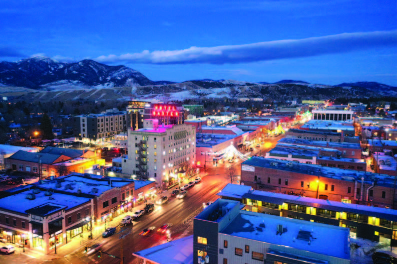 Bozeman, MT
Five counties, dozens of towns, one shared way of welcoming people in.
Read the story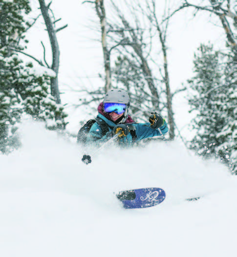 Big Sky, MT
Three of Montana's biggest ski areas, plus everything in between.
Read the story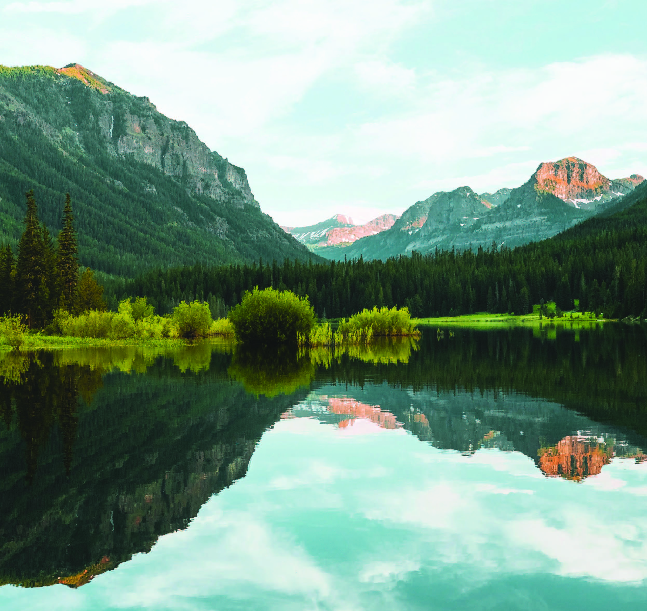
Hot springs, fly-fishing on the Yellowstone, dinner at the Murray. Built for first-time visitors.
View itineraryEight small things every visitor can do to leave Yellowstone Country better than they found it.
Take the pledge<article class="card">
<div class="card-media">
<img src="..." alt="">
<span class="card-credit">Park County, MT</span>
</div>
<div class="card-body">
<span class="eyebrow">Pillar 1</span>
<h3 class="card-title">Captivating Landscapes</h3>
<p class="card-text">…</p>
<a class="card-link" href="#">Read the story →</a>
</div>
</article>
Alerts use a thin left accent (::before) in the relevant brand color and ALL CAPS condensed labels. Avoid red panic-states; the brand prefers calm prose with a clear next step.
Beartooth Pass is open seasonally. Check conditions before you go.
Your itinerary has been saved. Check your email for the full guide.
Carry bear spray on every hike. Store food in approved containers.
The road from Mammoth to Norris is closed for the winter.
<div class="alert alert-info">
  <i class="ico ion-ios-information" style="font-size:18px" aria-hidden="true"></i>
  <div>
    <strong>Trail Conditions</strong>
    <p>Beartooth Pass is open seasonally.</p>
  </div>
</div>
The top nav is fixed at 90px on tan, yellow underline on the active item. Tabs are ALL CAPS condensed with a 2px yellow rule. Breadcrumbs use • as separator.

Fewer crowds, baby wildlife, waterfalls, wildflowers, biking in the park.
The quintessential summer adventures — Yellowstone, the Beartooths, fishing on the Yellowstone, farmers markets in every town.
Golden cottonwoods along the rivers. Fewer visitors. The elk rut at dusk. The best season for locals.
Three of Montana's biggest ski areas, snowcoach tours into Yellowstone, geysers steaming against snow.
Tables use ALL CAPS condensed headers, tan zebra striping, and hairline rules — same vocabulary as cards. Tags come in three sizes and four tones.
| Trail | Town | Distance | Elevation | Season |
|---|---|---|---|---|
| Lava Lake | Big Sky | 5.8 mi | 1,640 ft | Jun – Oct |
| Pine Creek Falls | Livingston | 2.6 mi | 720 ft | May – Nov |
| Beartooth Lake Loop | Cooke City | 4.1 mi | 410 ft | Jul – Sep |
| Hyalite Peak | Bozeman | 11.4 mi | 3,470 ft | Jul – Oct |
| Sacagawea Peak | Bridger | 4.6 mi | 2,000 ft | Jul – Sep |
Overlays use a navy scrim with a 2px blur. Drawers slide in from the right at 480px wide. Toasts stack bottom-right with a hairline border in the tone color.
Press Esc to dismiss any open overlay.
<div class="overlay">
  <div class="modal">
    <button class="modal-close"/>
    <h3>Subscribe</h3>
    <p>One email a month. Unsubscribe any time.</p>
    <input class="input" placeholder="you@example.com"/>
    <button class="btn btn-primary">Sign me up</button>
  </div>
</div>
<aside class="drawer is-open">
  <header class="drawer-head">
    <span class="eyebrow">Itinerary</span>
    <button class="btn-icon"/>
  </header>
  <ul class="drawer-list">…</ul>
</aside>
Pre-built compositions you'll reach for again and again — hero, listing row, pillar grid, footer CTA. All built from components above.
From the quiet springs to the golden autumns, the quintessential summer adventures to the world-class winter recreation.
Quite frankly, there is nowhere else like it in the country.
Learn more
We help visitors plan their trip — and remind ourselves how lucky we are.
Learn more
Three of Montana's biggest ski areas, plus everything in between.
Learn more
Eight small things every visitor can do to leave it better than they found it.
Learn moreEight small things every visitor can do to leave Yellowstone Country a little better than they found it.
Take the pledge